To me creativity, imagination and collaboration are the foundation for a better society. I integrate creative thinking, information design, cognitive science, and field research.
What I do

Education & Research to empower people and society

Education & Research on Information Design & Human-Centered Research

Talks, Workshops & Short Courses

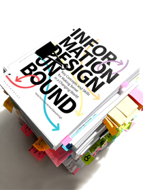
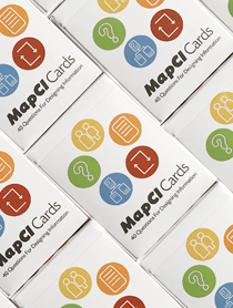
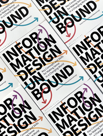
Books, Journal Articles & Resources
Current Projects
1.
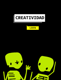
Creativity & Science
Courses designed for experience scientists and PhD students to learn how to practice deliberate cognitive creativity.
2.
Everyday Creativity
Workshops and courses designed to help people reconnect with their individual creativity to improve well-being.
3.
Design Research
Supervising students’ Masters thesis and collaborative projects working with design transdisciplinary approaches.
4.
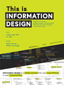
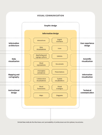
Information Design
Rethinking higher education to equip students with the necessary mindset and skillset for a changing world.
Latest Posts

“Anything real begins with the fiction of what could be. Imagination is therefore the most potent force in the universe. And you can get better at it. It’s the one skill in life that benefits from ignoring what everyone else knows.”
— Kevin Kelly
