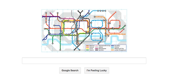

Tomorrow the London Underground is 150 years old!
On 8 January 1863, the journey completed between Paddington and Farringdon stations by the Metropolitan Railway (today Metropolitan line) was the very first one of the London Underground. Since then, the Underground system has grown from 30 to over 270 stations, and the number of travellers has rocketed from 26,000 in the first six months to more than 3 million daily. During 2013, various events (details at the end of the post) will take place in London to celebrate the uninterrupted development of the oldest and biggest underground system network (Ovenden, 2005).
Today, I won’t write about the London Underground diagrammatic map, which was first created back in 1933 by Henry Beck, as I have already done it before [here, here and here]. Instead, I will tell the history and evolution of the roundel (also known as the bulls-eye), the current logotype and trademark of Transport for London (TfL).
The beginnings of the roundel
1908 was the year that a red solid circle and a horizontal blue bar were first combined and used as the roundel. Initially, the roundels began to be used on the London Underground as station and platform name boards, helping travellers easily spot the name of the station from surrounding visual noise, such as posters and commercial advertising.

Until all underground railway companies were independent service companies. That same year, the name ‘Underground’ began to be used to describe the join services and the ‘roundel’ as a way to represent that unity. The first versions of the roundel used as a logotype vary quite a lot from the current one. Its evolution can be appreciated in the typography designs tried out until a standardised typeface was created in the late 1910s. In addition to use the roundel in platforms, it started to appear outside stations as a wayfinding sign and on commercial advertising. These were the first steps towards the definition of a graphic identity for the London Underground.
Johnston’s roundel
In 1913, Frank Pick, the London Underground’s publicity manager, commissioned Edward Johnston to design a typeface for the company. Four years later, based on Johnston’s typeface design, the proportions of the roundel were adapted and the solid red disc changed to a circle. And on 1919, the roundel started to be used as a logotype on a varied range of design pieces, including board posters and publicity.
3D roundels
In 1924, the architect Charles Holden, also commissioned by Pick, designed a 3-dimensional prototype of the roundel and introduced it to station architecture. The architectural roundel greatly assisted passengers in identifying stations at street level. In the 1930s, he added the 3D roundel to bus stops flags and shelters.
By 1933, Johnston designed a variation of the roundel for each operating division of the Underground Group, providing the unified identity for both rail and road services. In addition, he also designed a style manual describing guidelines for the application and reproduction of the roundel.

In 1947, London Transport was nationalised and the signage was simplified: letters displayed on the bar of the roundel became the same size and the key lines were removed (See image 1, left roundel). In addition, the name ‘Underground’ replaced ‘London Transport’on the centre of the roundel.
Standardised roundels
It wasn’t until the late 1980s that the brand consultancy Wolff Olins was commissioned to develop roundels for the other operating companies of London Regional Transport (i.e. London Transport Buses and London Underground), linking the family of companies in a visual way and in the minds of the public. In addition, a New Johnston typeface was designed, replacing the old one in the roundel. In 1990, the name London Transport was first used to refer to London Regional Transport, London Transport Buses and London Underground.
The family of roundels

On 3 July 2000, Transport for London (TfL) was established to take charge of the majority of transport services in London: bus system, underground, railway, overground, Docklands Light Railway (DLR), Croydon tramlink and river services. From then onwards a ‘family’ of roundels was designed using a plain blue as the distinctive colour for TfL and different colours to identify each of the various services.
Nowadays, the roundel has become an integral part of the city, as well as the London Underground.
– Leboff, D. & Demuth T., 1999. No need to ask! Early maps of London’s underground railways. Singapore: Capital Transport.
– Ovenden, M., 2005. Metro maps of the world. Harrow (Middlesex): Capital Transport.
——————————————————————–
London Underground 150th Anniversary Events
To celebrate the anniversary, London Underground, London Transport Museum and Transport for London have planned diverse events and activities, including talks, Art & Design exhibitions, and the design of exclusive souvenir collections among others.
London Transport Museum: Friday 15 February to Sunday 27 October 2013. Poster Art 150. London Underground’s Greatest Designs. 150 of the best London Underground poster designs, since the best poster commissioned in 1908.
Museum Depot (Acton Town): April and October 2013. Behind the Scenes Events and Open Weekends at the Museum Depot. More than 370,000 items of all type related to urban transport and the London Underground (including poster collection, vehicles, signs, models, photographs, engineering drawings and uniforms) and which are not on display in the main Museum in Covent Garden can be found in this museum.
Leave a comment